Ready to put your creativity into into motion? From retro to glitch, here are the top motion graphics trends we predict for 2022.
The world of motion graphics has experienced a big boost over the last few years. While in-person events took a hit throughout the global pandemic, video creators turned to stock footage, animation, and began experimenting with motion graphics to come up with fresh ways of delivering content.
Now, motion graphics are dominating across all industries. From subtle in-app animations to full promotional videos, the versatility and innovation of motion graphics cannot be matched. And, as a creative discipline directly linked to the development of technology, it’s no surprise that motion graphic trends are constantly shifting and evolving.
In previous years, motion graphics trends have consisted of eye-catching color palettes, dynamic animations, simplistic design, and retro elements. But what will 2022 bring? From kinetic typography to liquid motion, here are the top 8 motion graphics trends that we’re predicting will move us over the next year ahead…
1. Animated Collage
Animated collage consists of everything from illustrations and photos to animations and digital footage, combined to create a crafty look and feel. The result is a curated collection of visuals that work together to tell a story.
For example, this experimental motion collage by graphic designer Andreea Robescu uses a black-and-white image of a woman as a starting point, before layering swirling colors, video clips of speeding trains, and torn-paper textures. The effect is chaotic, energetic and constantly moving, while ensuring the eye is anchored to the central image.
Animated collages are perfect for those who seek inspiration from a range of sources. Get started by checking out the Mixed Media Collection in the Envato Elements Library, which is filled with assets designed to create eye-catching animated collages.
2. Kinetic Typography
Text and fonts are major components of motion graphics, and kinetic typography takes these design elements to the next level. Perfect for capturing attention and telling a story, the head-turning effect of kinetic typography make it perfect for advertisements, websites, music videos and title sequences for movies and TV shows.
This trend can be seen in this collection of Voting Art, designed to encourage people to engage with politics. While some animations emphasise each letter individually, others make the whole word pop as it expands and contracts or twists and turns to fill the screen.
“There’s something strangely satisfying about seeing animated text,” says Marco P. Korreli, Envato Video Producer. “Whether it’s just a word or a complete sentence, we often ignore how motion enhances, complements or even modifies the meaning of a text.
As technology became available (and more affordable) for standard users, the motion graphics era exploded into a fascinating landscape of styles, trends and truly interesting techniques. So much so that you’ll hardly find a piece of media without some basic moving text today.”
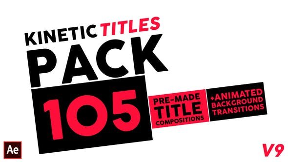
Give life to your words and add visual interest to logos with this Kinetic Typography Pack from Envato Elements, which features 19 ready-to-use scenes and 30 titles, all of which can be fully customised in order to convey your message. Simply pick a color scheme, adjust the video length and cut and paste your message to get started.
3. Glitch
Glitch effects give video creators permission to introduce imperfections they’d usually try to avoid at all costs. A trend that embraces disruption, distortion and digital noise, glitches are great for creating a raw, edgy DIY aesthetic that pays tribute to analogue printing presses and hand-drawn animations.
Take this teaser video from K-pop girl group Aespa, which flickers and blurs between real-life action and anime illustrations.
Start creating your own glitchy motion graphics by adding grain, grit and grunge to your videos with this pack of glitch transitions from Envato Elements. Featuring flickering static, distorted colors and neon-green binary code, they can be combined with music and text to add an edge to explainer videos, a YouTube channel opener or a website homepage.
4. Isometric Shapes
While originally used in technical drawing, isometric shapes are also being used by motion designers looking to introduce a 3D feel into their 2D animations, or give a unique perspective to their 3D renders.
This is in contrast to one-point projections, which instead make objects feel smaller the further away they are from the viewer. Take for example this video opener for OFFF, a Barcelona-based design festival. Displaying a perfect example of two dimensional isometric motion graphics, it shows that isometric shapes can be injected with playfulness and personality to add extra depth and perspective.
“In my opinion, the work of a motion graphics designer is an easy one with this trend,” says Marco. “Since Isometric design is all about simplicity and accurate representation, you’ll most likely receive a pack of illustrations that need to be deconstructed into layers and reformed in some animated fashion. You pretty much know where everything is going to end.”
On the flip side, this example from Spotify Premium, is a great display of isometric angles in a 3D environment. It shows animated characters listening to music in a variety of pop-up settings and situations, transitioning from studying to exercising.
If you want to immerse viewers in a thrilling 3D environment, look no further than these isometric loops that can be added to video openers to give a fluid look and feel. Or, add dimension to any design with these isometric icons from HolyPix. From science labs to law courts and classrooms to the corporate world, a range of everyday scenarios and associated objects are vividly rendered and just waiting to be included in your next project.
5. Retro
Some design styles become so popular that they come to define an entire era – like the iconic yellow smiley face of the 1970s or 1950s-style hand-lettered logos. The retro motion graphics trend uses these styles, images or motifs which have become eternally embedded in popular culture to evoke a sense of nostalgia.
“The fun thing about retro is – it’s trending!” says Marco. “But what makes something ‘Retro’? For example, whenever we look for retro fonts we usually have to be rather precise when choosing. Is it the one from the 1968 Mexico Olympics? Is it that slim art deco one from the Great Gatsby? It’s all about knowing what constitutes the feel of an era and letting your imagination do the rest. It’s your job as a motion graphics designer to understand why something looks old but feels modern. Because just like fashion, you never know when that weird thing your folks used to like is making a comeback.”
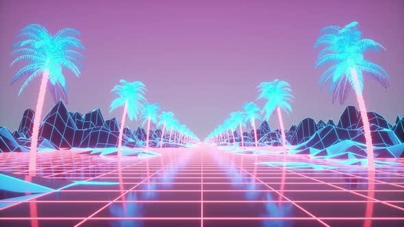
This 80s-inspired example instantly channels some of the most recognizable retro TV shows, movies and album covers of the era with its tropical palm trees, sunset pastels and neon cityscapes.
Thanks to the addition of a moving grid, shooting lasers and lens flare, this animated background is a celebration of space exploration and reality-bending science fiction. From Star Wars to Tron, it’s impossible not to think of the 80s when you see this purple-pink creation from Envato artist VictoryBox.
6. Grain Effects & Texture
Similar to glitch, this next trend focuses on adding character using imperfections such as grain effects and texture – the kind of design ‘noise’ that can be seen in this example from design collective Reverse Charades. With its images of humans and household objects, as well as symmetrical shapes and squiggles, this montage not only highlights the grain effect, but is also a great example of mixed media in motion graphics.
To bring an analogue aesthetic to your work, try out this Risograph Grain Effect pack from Envato Elements. Drawing on inspiration from screen printing to come up with three grain intensity options, five grain textures, and 50 pre-made gradients that will transform your motion graphic designs.
7. Morphing
As the name suggests, this trend refers to a special effect which morphs animations together through seamless transitions. The effect is smooth, streamlined and completely transportative.
Combining busy city streets and sparkling skylines with the Eiffel Tower and Champs-Élysées, this morphing display of motion graphics brings Paris to life in vivid motion. Presenting several locations in just a few seconds, it offers a fast-paced and compelling view of the City of Lights.
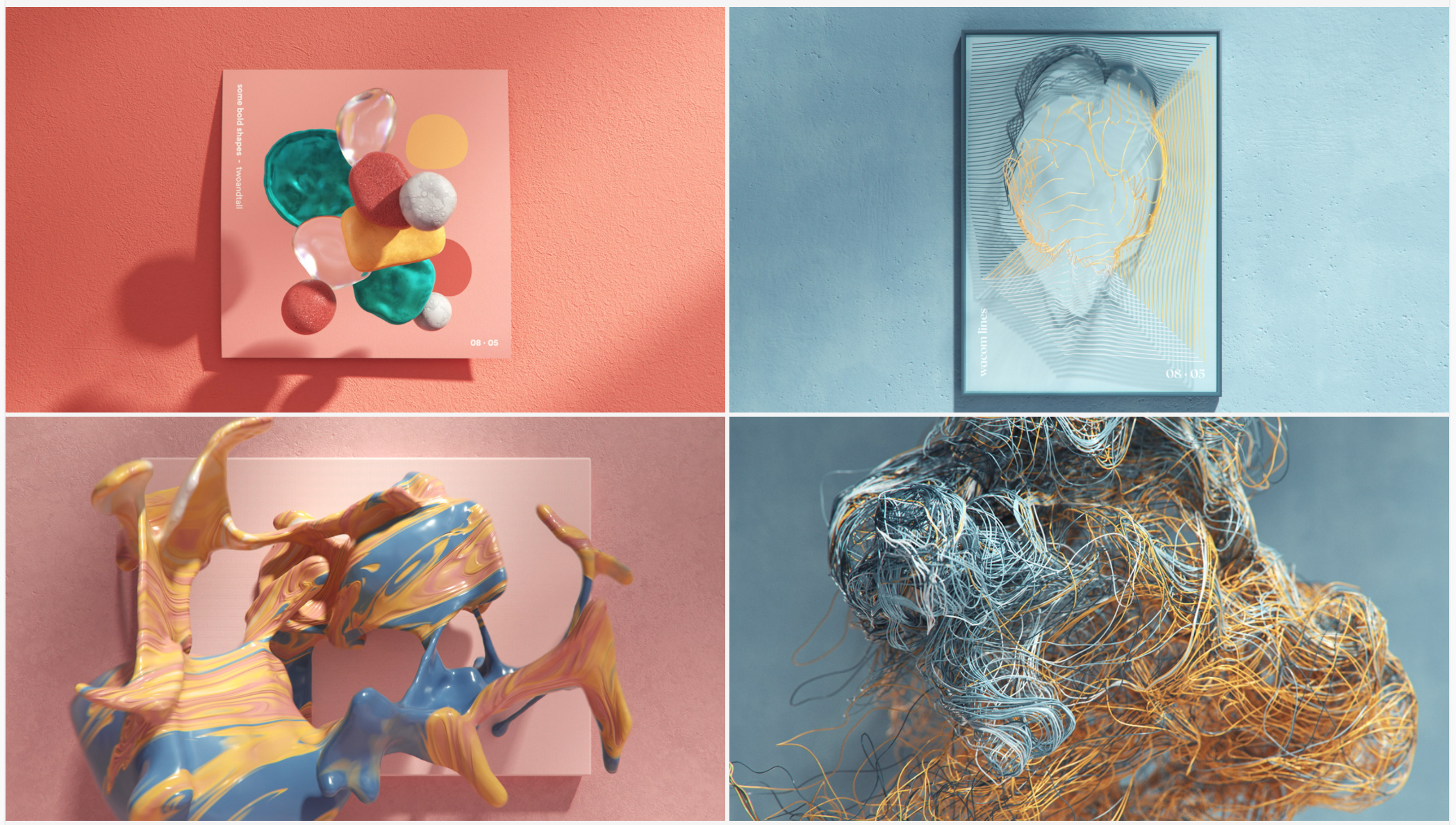
In contrast, this Wacom video which advertises the brand’s modern stylus draws on abstract objects that morph and merge. Here we see shapes, materials and textures transform and change in the blink of an eye, keeping the audience constantly guessing as to what’s coming next. It also has an element of our next trend, Liquid Motion.
8. Liquid Motion
Our final trend for this motion graphics round-up is liquid motion. This technique creates movements rendered to have a water-like quality and consistency. Ebbing and flowing from ripples to waves, these animations resemble 1960-style psychedelic art with a modern twist. Combined with swirly typography, this trend mirrors moving liquid.
For example, this video from Dutch marketing agency Alfred achevies a fast-paced feel using liquid motion animation that morphs studio footage, illustration and a speedy demonstration of how the app actually works.
Add movement and motion to your next project with this Liquid Opener template from Envato Elements, which features five unique transitions that splash and spray across the screen in a kaleidoscope of color.
And that does it for our top Motion Graphics Trends for 2022! For more trend predictions, check out our Graphic Design Trends for 2022 and these top 5 Social Video Trends: From Going Live to YouTube Shorts.
Posted By Kelsie Rimmer

