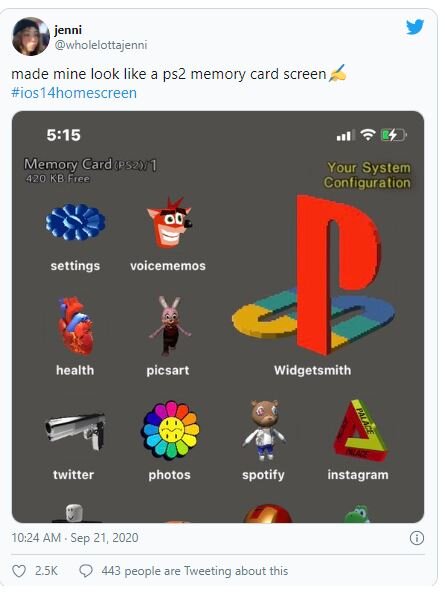
BY JENNIMAI NGUYENThe TikTok teens took the internet by storm and convinced me that my home screen needs a major upgrade. As in: matching color schemes, aesthetically pleasing icons, and an overall theme that conveys my personality, all made possible by the latest iOS 14 update.
Creating the perfect home screen isn't easy, though. The teens claim that creations like this Mean Girls masterpiece can take hours to complete.
I decided to try it for myself, and time each step to give you an idea of how long this really takes.
Step 1: Update your phone
Before you can tap into your inner designer, make sure you have iOS 14 installed on your phone. The software update is only available on the iPhone 6S and up, so if you have an iPhone 6 or below, you’re stuck with your generic home screen for now.
Time spent: 45 minutes (OK, this is a big time killer, but that’s not my fault.)
Step 2: Pick your preferred widget app
The big new thing with iOS 14 is the ability to support widgets. Yes, we know Android has had this for ages, but just let us enjoy the moment, OK?
IMAGE: SCREENSHOT VIA MASHABLE
While the update supports widgets, not all apps have native widgets. Definitely annoying.
But you can download an app that lets you create widgets. There are a ton out there, including Widgetsmith, Widget Wizard, and Glimpse 2. Widgetsmith seems to be the most popular option, so that’s what we’ll be using here.
Time spent: 1 minute
Step 3: Figure out your aesthetic
Easily the most stressful step (for me), the photos you choose decide your phone’s entire vibe. Panic!
While some widgets are designed for functionality (think pinning your most used apps to your home screen, like weather and the clock), the rest of the space is up to you. Scroll through Pinterest or Twitter for some inspo, and then download photos that match your desired look. Make sure to change your wallpaper to match, which you can do by going into Settings and clicking Wallpaper and choosing from your photo album.
Time spent: Infinite
SEE ALSO: How to enable iOS 14's coolest hidden feature
Step 4: Design some widgets!
Some iPhone apps already have iOS widgets. To pin them to your screen, long-press your screen until the apps get all wiggly. Then press the plus sign on the upper right-hand corner of the screen and add your preferred widgets. I use my weather app all the time, so that definitely made the cut.
Otherwise, go into Widgetsmith and start designing widgets. When you open the app, you’re greeted with three size options. Pick which one you want, and then click Default Widget. Under Style, scroll to Photo, then click Selected Photo to pick the image you want.
Once set, make sure you click Save. Repeat this process with as many widgets as you want and then add them to your home screen.
Time spent: 10 minutes
Step 5: Shortcuts
OK, so you have your big feature photos up, but how do you make your apps look cohesive and cute? This part is actually not new: to change your app icons, we’ll be using the Shortcuts app already on your phone.
You’ll need to download the photos that you want for your app icons. I kept it simple and made all of my apps shades of blue.
Go to Shortcuts, and then hit “+” on the upper right. Select Add Action and then search “open app.” You’ll see Open App under Actions. Tap on Choose, and then choose the app.
Click the three dots in the top right corner and enter your shortcut name, usually the name of the app, and click Add to Home Screen. Once there, click the image icon and select Choose Photo.
Then rename the app to whatever you’d like, click Add, and it will appear on your home screen.
Rinse and repeat… and repeat and repeat and repeat, depending on how many apps you have. This is definitely the most time-consuming step, as most people have a ton of apps.
Time spent: 15 minutes for one page
Step 6: Hide your old apps
So here’s where the lazy part kicks in. Say you finish designing one page and realize you have about 27 apps too many. I get it. Press and hold anywhere on the home screen, and click the dots at the bottom that indicate how many pages you have.
Click on any of the un-aesthetic pages left over, and they’ll get bundled together in your App Library, which appears at the end of your home screen scroll.
Time spent: 3 minutes
Step 7: Admire your hard work
IMAGE: SCREENSHOT VIA MASHABLE
You’ve done it! Now it’s time to reflect on whether it was worth it. In total, I spent about an hour and a half designing just one page. If I was really gonna stick with the theme, I can totally see how this could take hours, as the process of creating Shortcuts for each app is pretty tedious.
It also comes with a minor inconvenience. Since you’re using the Shortcuts app, every time you open one of your nice new icons, it takes you to the Shortcuts screen for a split second before sending you to your desired app. You also don’t get notification bubbles on these apps showing how many unread messages, snaps, etc. you have. This doesn’t change the usability of the app, but if you think it’ll annoy you, the aesthetic home screen life might not be for you.
Source: Mashable website


