Nothing gets designers going more than the subject of gradients.
Those who remember the olden days of WordArt still cringe when they hear the word; others who are newer to the design scene might have missed that unfortunate period, and they’re able to look at gradients with fresh, optimistic eyes.
We’re on the cheerful end of that spectrum, in that, like with every other design element, we believe gradients can add something to a logo design if they’re used in the proper time and place.
Although some might accuse gradients of being a logo design trend rather than a regular color technique, timeless logos such as Instagram and Airbnb have used the gradient to their success – and so can you!
But first, the obvious question:
What is a Gradient?
A gradient is a design element made up of colors that gradually fade into one another. Also known as “color progressions” or “color ramps,” gradients either consist of many shades of the same color, or multiple colors that blend from one to the other.
The point of a gradient isn’t necessarily to have multiple colors in a single design; rather, it blends the colors so that each shade transitions into the next – creating an overall cohesive effect.
And, while flat logos are making a huge splash these days with new businesses, gradients can make for equally strong logos.
When to Use Gradient Logos
Gradients should be used to accent a strong logo, not hide a weak one. You also don’t want your gradient to be the selling point of your logo; if anything, it should be used to add a little extra flair to your design, but only as a point of enhancement to the other elements of your business’s logo.
That said, here are a few other scenarios in which to consider using a gradient:
When it's relevant to your brand identity.

When designing any type of logo, it’s important to think about what kind of vibe you’re trying to put out into the world – and gradient design is a vibe unto its own.
It implies creativity, imagination, innovation – all great things, but not necessarily suitable for your specific brand personality. A lawyer, for example, might not want those traits associated with his/her litigation firm, but a band logo would fit right in with that overall image.
When your business is internet-based.

Gradients tend to look much better on screen than they do in print, so you’ll want to think twice before choosing a gradient if you’re planning on branding a lot offline.
A restaurant logo probably would do better with a flat design, because you’ll likely be putting your logo on menus, napkins, and a storefront. Gaming logos, however, can definitely incorporate gradients – both to separate yourself from the competition, and to be remembered for your unique logo.
When your logo carries its own weight.

Like we mentioned above, a gradient isn’t meant to be the sole focus of your logo; it’s only there to enhance, the same way an accent of color or a secondary font would.
There may be times when you need a transparent logo (a version of your logo that works on colorful backgrounds), and in scenarios like those, your logo will have to stand on its own – without a gradient to back it up.
When your logo is easy to read.

Gradients can often distort the text of a business name or make it more difficult to read, depending on how intense the effect is. It’s best to shy away from adding gradients to a wordmark logo, or logo that uses only text (no symbols or icons) – unless the gradient is VERY subtle.
Advantages of Gradient Logos
When all is said and done, why would a business actively choose to use a gradient design when it’s easier to create a flat logo? The answer is simple: It will set your logo apart from competitors.
Among other things, gradient logos are:
Memorable.
Because they’re currently not the norm in the world of logo design, gradients are able to make a long-lasting impression that flat logos sometimes can’t.
We’re used to talking about colors like they’re singular entities – the sky is blue, this cherry is red – so when we see colors that we don’t have language to immediately describe, the image isn’t as quick to leave our heads as those with flat colors we’re accustomed to seeing.
Creative.

Like we mentioned above, your logo design should speak to your brand identity, and gradient logos own a lot of creative real estate. If your business is in the arts, in innovation, or simply wants to be known as a company that finds out-of-the-box solutions for their customers, then you’ll want a logo that can communicate that creativity to your audience.
Realistic.

If you look around, you’ll notice that objects in nature are rarely characterized by a single color shade. Trees have a compilation of greens, browns and oranges; dirt segues between blacks, browns, and reds.
In other words, our eyes are much more accustomed to seeing gradients than flat designs in our everyday lives, and with a gradient logo, you can make your business that much more alive in the minds of your audience.
Playful.

By using a gradient logo, you’re engaging your audience in conversation with your brand. You’re letting them know that you’re different, you have spunk, and you’re not afraid to make bold choices – both as a brand and as a business.
Tips for Creating Gradient Logos
You may already know how to make a logo, but you’ll want to keep these tips in mind before plunging forward on your gradient journey:
1. Keep it simple and subtle.
Simple = professional, and a subtle gradient can enhance the logo design you’re already working with. A gradient that’s too intense, on the other hand, will dominate the design, making it unpleasant to look at and difficult to print.
2. Focus on contrast.
If you’re pairing your logo with a colorful background, contrast between the two is key.
You don’t want your gradient to clash with the background, and you certainly don’t want your logo to get lost because the colors are too similar. Make sure that you have contrast in your design while having all of the elements give off the same mood.
3. Make a solid version of your logo first.
Settle on a logo design that you like; then, see if you can enhance it with a gradient. By creating a solid version initially, you’ll know if your logo is able to stand on its own when printed or put on a colored background. And, you may find that your logo doesn’t even need a gradient to stand out.
4. Be intentional about your colors.
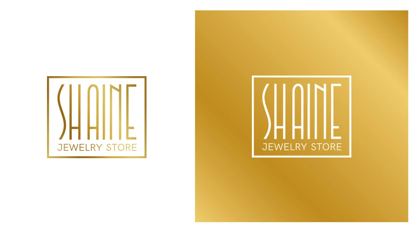
Gradients aren’t just meant to look cool; they’re also supposed to pack meaning into a logo. However, you want to make sure that the meaning you’re giving your logo is on-brand. If you sell jewelry, there’s no need to throw in a rainbow; if you have a solution for creating clean water, stick with different shades of blue.
5. Test it over black and white backgrounds.
How does your logo look with no background? What about if it’s on a black surface? To optimize your logo for printing, first try it out on product mockups and different mediums. Make sure your logo is versatile before committing to the design.
Over to You
You now have everything you need to design a gradient logo; the question is, what are you going to do about it?
Whether you decide to hire a designer or use an online logo maker to get the job done, you should think ahead of your logo colors and consider creating a gradient logo for your business – both to set yourself apart from the crowd, and to tell the world your business isn’t afraid to be bold.
Article source: Tailor Brands Blog