Imagine hauling around heavy boxes of metal type — a different set for every typeface — and having to assemble your text letter by letter in order to design a document.
That seems a world away from our point-and-click, instant world of digital design. But it really wasn’t too many years ago that a font would have been known as a specific set of movable metal type — rather than a funny name in software program’s drop-down menu.
Although our design methods have come a long way, sometimes navigating the modern process of choosing and using fonts can seem almost as difficult and complicated as the good old days of metal typesetting and printing presses. So if you’ve ever felt a little lost when it comes to fonts, then you’re in the right place.
This guide is designed to offer a comprehensive overview of fonts: their different categories, how to choose them, how to use them, and even where to find free font downloads.
1. What types of fonts are there?
Short answer: there are many, including some crazy ones that defy categorization. Typographers, typeface designers, and others interested in the history of typography might tell you that there are many classifications, each with their own historical and technical definitions, and they’d be right. Some classifications you may have heard of include Old Style, Blackletter, or Humanist. But we’re not going to concern ourselves with those in this article (though if you’re interested, there are plenty of resources you can find online, like this one). Instead, we’re going to focus on four basic font categories that will be useful to understand when you’re going about choosing a suitable font, combining fonts for your design project, or discussing your type choices with other people.
1. Serif: Serif fonts have little “feet” or lines attached the ends of their letters. They’re generally thought to look more serious or traditional.
2. Sans-Serif: “Sans-serif” literally means “without serif” — these fonts don’t have the extra lines on the ends of letters. For that reason, they’re generally thought to look more modern and streamlined.
Though this point is often debated, it’s commonly said that serifs make long passages (in print) easier to navigate visually, helping move your eyes along the lines of text. However, because serifs are usually small and thin, they often don’t display as well on pixel-based screens (looking distorted and “noisy” rather than clear and crisp), so many designers favor sans-serif fonts for web use, especially at small sizes, like in logos.
3. Script: Scripts are what we might think of as cursive- or handwriting-style fonts. They generally have connecting letters. You’ll find that script fonts come in many different styles, from elegant, to fun and casual, to hand-drawn.
4. Decorative / Display: When you hear a font categorized as decorative, display, or novelty, it all means the same thing — that font is meant to get your attention. They’re often more unusual than practical and should only be used in small doses and for a specific effect or purpose.
02. Is it a font or a typeface?
You may have heard the text you use in design projects referred to as both fonts and typefaces and wondered if the two terms mean the same thing. Technically and historically (in terms of typesetting) they’re different, but today, they’re often used interchangeably. If you’re interested in understanding the difference, a few snappy definitions might help:
The typeface is the design; the font is how that design is delivered. typeface + style + size = font A font is what you use; a typeface is what you see. The distinction dates back to traditional printmaking with metal type. The unique style or design of the alphabet that we identify by name — say, Times New Roman or Bodoni, would be considered the typeface. When those letters needed to be cast at a particular size or weight (10 point bold, for example), that would be considered a particular font. So 10 pt. Bodoni bold and 24 pt. Bodoni italic would be two different fonts, but the same typeface.
All that to say, that for most graphic design purposes today, the terms are more or less interchangeable; fonts are the digital representations of typefaces, and we can change either with a simple click on our computer screens… So unless you’re talking to a typography expert who you want to impress with your superior knowledge, no need to worry about the differences.
3. Why do font choices matter?
Designers (including Erik Spiekermann, Dan Mayer, and Jessica Hische) have been known to compare choosing fonts for design projects to choosing an outfit to wear. And it’s an apt analogy. Think about what your clothes might say about you: based on what you wear, people might rightly or wrongly make assumptions about your style, your personality, your socio-economic background, your age (or the age you wish you were), or the kind of impression you want to make. And different occasions and situations call for different apparel. You wouldn’t wear a bathing suit to a job interview; then again, you wouldn’t want to wear a suit and tie during your vacation on the beach either. There’s an element of appropriateness to consider.
Now, what your clothes do for you, font choices serve the same purpose in a design. Typography often provides that at-a-glance first impression that people gauge and judge the rest of the design by — so your font choices need to be purposeful and appropriate. Is your font saying “beach vacation” when it should be saying “job interview”? Do the elements of your font “outfit” clash, or do they complement each other? Are they effectively communicating the qualities you want to project? These considerations are part of what makes choosing fonts such an important part of the design process, one that should be approached thoughtfully.
Font choices often set the tone for the whole design and can influence viewers’ feelings toward and interactions with your design — just like how if you were to show up at a black-tie party in your favorite threadbare t-shirt and sweatpants, people would judge you on your appearance. Don’t be that guy with your design and give viewers an excuse to make incorrect assumptions about your brand or business; bad typographic choices always distract from your design’s message and intentions.
Not sure where to start? This next section will get down to the nitty-gritty of choosing and using fonts with easy-to-understand explanations and practical tips.
4. How to Choose a Font
The Basics
Your first concern in choosing a font for a project should be that it matches the message or purpose of your design. Before you ever start browsing through fonts on your computer or searching for a new one to buy or download, it would be a good idea to brainstorm some of the qualities or characteristics that you want your design to communicate.
That way, when you’re choosing a font, you already have a blueprint that you can match up your font with. This is important because every typeface has its own mood or personality. Maybe it’s serious, casual, playful, or elegant. You’ll need to determine what a particular font is saying to you, and whether that fits with your design.
If the characteristics the font is communicating don’t match the message of your overall design, then there will be a visual disconnect for the viewers or users of your design, and you don’t want that. When browsing fonts, it can be easy to get caught up in all the fun and interesting choices, but don’t let personal preferences get in the way; a font you think is distinctive or stylish may not be useful or appropriate for the project you’re working on.
If you find yourself getting off track, just ask yourself this question: Does this font support the qualities of my brand or complement the purpose of my design? The most effective font choices do just that.
Consider context and audience.
Where and how your design will be viewed should also figure into your font choices. For instance, a business card design will need a font that’s easily readable at a small size. Or social media graphics, which are likely to be viewed on mobile devices, would benefit from fonts that display well on screen.
Who is viewing your design may also be important. Is your audience of a certain age or demographic? Will your font choice resonate with them?
Is your font choice suitable?
More than the mood or character of a font, and related to context, suitability is more of a functional matter. Will the font you’ve chosen actually work where you’re intending to use it? Will it be practical and easily readable in the context of your design?
One of the most common mistakes that beginners make is not realizing what various font categories are most suitable for — for instance, body typefaces versus display typefaces.
Body typefaces are used in body copy: book text, magazine or newspaper text, website content, any lengthy passages. These fonts are easy on the eyes and easy to read. It’s important that they’re not distracting, so users can easily skim or scan the text. This is the category that fonts like Times New Roman and Arial fall into. (Though these two particular fonts happen to be pretty overused; we’ve suggested some great alternative body typefaces in our article, “20 Best and Worst Fonts to Use on Your Resume.”)
Display or decorative typefaces (briefly mentioned at the beginning of the article), on the other hand, are never suitable for reading at length. These are the type of fonts that scream, “Look at me!” They come in various degrees of usefulness, from the bold, all-caps fonts that might be used for headlines, to the fonts that are very literal or obvious — such as snow-capped letters that seem to say “I’m supposed to be used at Christmas!” or letters that look like they’re made of made of logs or twigs that supposedly give your design an instantly outdoorsy look. These types of fonts can be fun and have their uses, but good design, especially design intended for business or professional contexts, often has more subtlety than that. Display fonts can make a big impact when used in the right way, but when used incorrectly, they can make a design look busy and amateurish — or completely unreadable.
In short, display typefaces differ from body typefaces in that they’re not easy to read at length and should be used sparingly and with purpose. If you have doubts whether a certain font is suitable for your design, it’s always a safe bet to pick a more neutral font. In the next section, we’ll get into how to choose a versatile, functional font that you’ll get a lot of good use out of.
Is your font choice versatile?
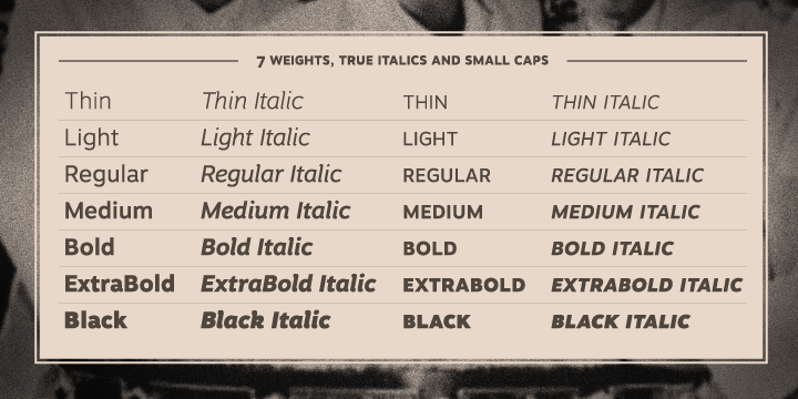
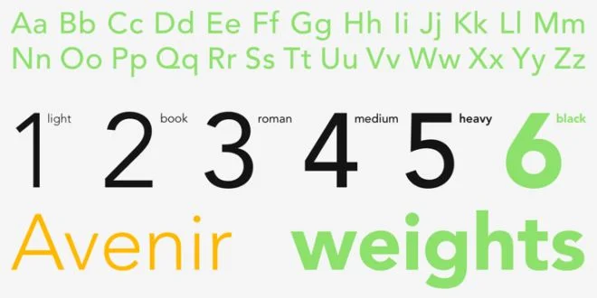
Every designer needs a few neutral fonts that adapt to their surroundings and can be a go-to choice when time is tight or nothing else seems to be working. These types of fonts, sometimes referred to as “workhorse” typefaces, are usually basic serif or sans-serif fonts that can be used pretty anywhere because they don’t draw a lot of attention to themselves. The most useful sort come in a variety of weights (such as light, regular, medium, bold, or heavy) and styles (such as narrow, condensed, extended, or small caps).
Having all those options (especially for a text-heavy design) allows you to assign different styles of the same typeface to different functions within your design, creating a very cohesive look overall. That’s why choosing a versatile font — especially if you’re planning on only using one typeface for your design project — will make laying out an attractive, easy-to-navigate design a lot easier.
Looking for some recommendations on a “workhorse” font to use yourself? Last year, more than 40 top designers weighed in on some of their favorite, go-to fonts. The results? Though answers varied widely, Avenir (and Avenir Next, a version updated for improved web use) was mentioned most often — but if you want it, you’ll have to buy it, and it isn’t cheap.
However, you don’t have to be independently wealthy to get your hands on some versatile fonts. Although they may not be as high quality or carefully crafted as a typeface from a top font foundry, there are plenty of fonts available that are free to download or commonly available on many operating systems that will do very nicely for everyday design projects. In the serif category, try Georgia, Andada, Crimson Text, Droid Serif, Heuristica, or Merriweather. For some sans-serif picks, check out Franklin Gothic, Clear Sans, Roboto, Lato, Source Sans Pro, or Merriweather Sans.
Is your font readable?
If you’re including text in your design, it’s likely that you have something important to communicate. Readability becomes an important quality to look for in a font to make sure your message comes across. How can you tell whether a typeface is readable, other than your own visual assessment? There are a few ways:
• Size: You’ll want to choose point size that fits your design context. A business card will need a different sized font than an event poster. If you’re designing something that might be viewed on mobile devices — social media graphics, for example — open up any word processing program and try typing a few lines using the font you’re considering and then reducing the size. If you can still easily make it out at smaller sizes, then it will probably perform well on small screens. If you Google any font name and look up some background information on it (likely on the website of its designer or foundry), you should be able to find out whether it’s optimized for the web.
• Spacing: Adjusting the spacing of your text so that it’s appropriate for your design is a big contributor to enhanced readability. In most cases, generous spacing improves readability. But if you’re tight on space, you’ll need to experiment with different combinations of font size and spacing to optimize readability. Most design programs will allow you to adjust letter-spacing/tracking (spacing between whole groups of letters in lines or passages of text), kerning (spacing between pairs of letters), and leading (vertical space between lines).
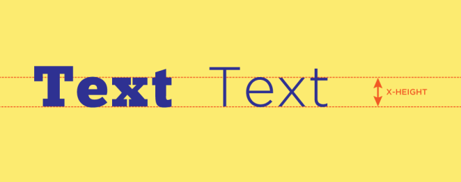
• X-height: This is the height of a font’s lowercase letters. A generous x-height in proportion to the typeface’s capital letters improves readability and maintains it at smaller sizes. However, you don’t want the x-height to approach so close to the capital letters that it’s hard to distinguish between the two cases.
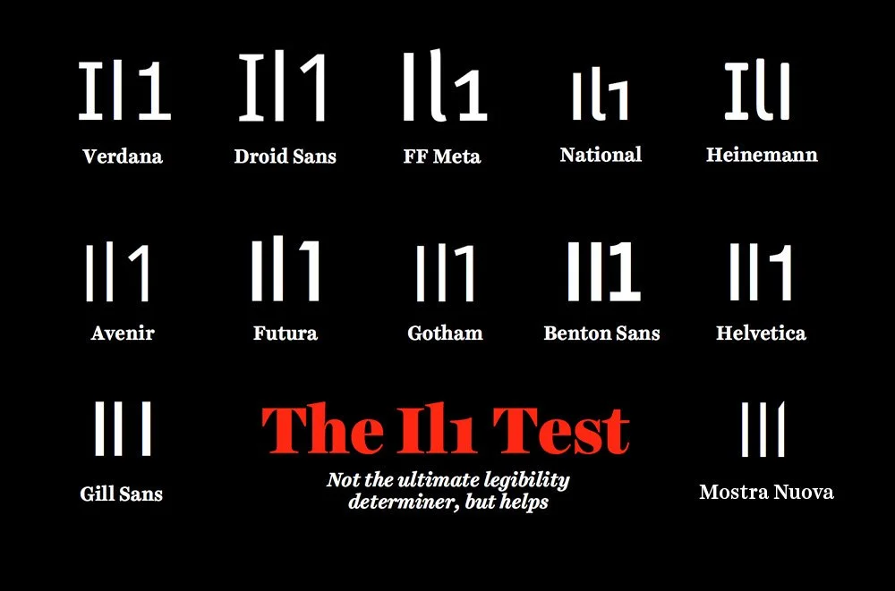
• The I/l/1 test: For any font you’re considering for passages of text that include both letters and numbers, try this: Type out a capital I, a lowercase L, and the number one. If two or more look identical, then readers might stumble over certain words or letter/number combinations.
Combining Fonts
Choosing two or more fonts to use together can be tricky. You want the fonts to complement each other, but not be too similar — different, but so wildly different that they clash. Avoiding these extremes of too little or too much contrast often ends up being a process of experimentation and trial-and-error — like Goldilocks testing out the three bears’ porridge and finding one too cold, one too hot, but one “just right.”
Finding a font combination with a level of contrast that’s “just right” isn’t a step-by-step process, but is usually the result of a mash-up of personal taste, practice, instinct, and observation. But this process doesn’t have to be completely mysterious. While you’re developing an eye for pairing fonts, you can take a few shortcuts to get started:
• Find a shared quality: Fonts that look significantly different but share something in common are more likely to work well together. That quality might be general proportions like letter height or width, or two fonts might share an underlying structure or skeleton. Even if the similarity is subtle, it will help give your font combination a basic cohesiveness.
• Find fonts by the same designer: Typeface designers often design with a unique approach or a recognizable aesthetic. Their fonts will share a certain look or structure that makes it easy to pair them. Look for font families known as “super-families” that come with both a serif and a sans-serif typeface designed specifically to complement each other, along with a variety of weights and styles to choose from. Want to try out a super-family? Download Alegreya and Alegreya Sans (two free font families with 40 weight/style options in all) or Merriweather and Merriweather Sans, which also appeared in our recommendations for versatile typefaces.
• Give each font a job: Your chosen fonts will need to be different enough that they create a clear visual hierarchy — showing viewers where to look and what’s important. One sans-serif and one serif font are often enough to do this effectively.
But how many fonts are too many? There are those in the design community who would say that one font will do for most projects, and that three is the maximum number you should include in one design to avoid an overly busy or confusing layout. While that’s a good starting point if you’re new to design, there really are no rules — at least, no rules that can’t be broken in the right situation. Some designs will call for a certain aesthetic or an extra-decorative look that would benefit from a wider range of fonts.
If you’re interested in learning more about how to combine fonts, we have a whole article on the subject: “10 Golden Rules You Should Live By When Combining Fonts: Tips From a Designer.”
Where to Find Free Fonts
Looking for a new font to try out, but don’t want to dig into your wallet? There are plenty of sites (of varying quality) that offer free font downloads. The number one thing to remember when downloading fonts is to check the license (more on that in a bit). First, here are several free font sources to get you started:
1. Font Squirrel: This is probably the best resource for fonts that are both free and licensed for commercial use (every single one on the site!). Includes a great selection of hand-picked, high-quality fonts that are searchable by classification (such as serif, san-serif, or script) or tag (such as casual, retro, or distressed).
2. Google Fonts: Created as a directory of free fonts for use on websites or other web-based projects and applications. Includes hundreds of fonts that are all Open Source (which means they can be shared, modified, customized, etc.) and optimized for the web (with instructions on how to add the appropriate code to your website or integrate the font into your CSS). They can also be downloaded to your computer for use on print projects, though it’s a little hard to find where to do that.
3. DaFont: Currently has over 25,000 free, public domain, and demo fonts available, but they are of varying quality since anyone can submit a font they’ve created. Many fonts are free only for personal use.
4. 1001 Fonts: Currently has over 7,000 free fonts available, that, like DaFont, are of varying quality. Includes a special section of free commercial-use fonts and offers a handy option to search by type/style/mood, decade, and even holidays and other occasions.
5. Others: These sites aren’t dedicated exclusively to free fonts, and aren’t extensive, but they have some nice options.
Lost Type Co-Op: Trendy, unique, and vintage-style fonts that are “pay what you want” (including nothing — though if you can afford to support type designers in even a small way, that would be nice!) for personal use and priced accordingly for commercial use. Fontfabric: A small but varied selection of free, professionally designed typefaces that’s updated with new options semi-regularly. FontShop: A source for buying fonts that offers certain weights and styles of a selection of its fonts for free. Must create an account to download. Pixel Buddha: Has a freebie section with a small selection of artsy and hand-drawn typefaces. Must create an account to download.
Font Licensing
When you buy a font or even download a free one, it’s not necessarily yours to do whatever you like with. Always check the license of the font you’re downloading before using it. Usually it will be licensed for personal, commercial, or educational use.
Some fonts have limits on how many times they can appear in print or online or how/if they can be distributed to other parties. Reading your font’s license is a good idea to protect yourself and/or your client. For a more technical overview, check out this introduction to font licensing from a law firm.
Inspired? Start designing with awesome fonts today!
Figuring out how to effectively use fonts in your design projects is a learning process, one that’s helped along by plenty of practice and trial-and-error. We hope that this guide provides a motivational starting point for learning how to choose appropriate fonts (and find free ones!) and apply them to your designs.
This article was originally published by Janie Kliever.
Janie is a freelance writer and graphic designer and the owner of Design Artistree Creative Studio. After college, she built on her background in art to explore design…and loved it. Now, she enjoys finding ways to combine the craftsmanship of traditional fine arts with the digital possibilities of graphic design.


