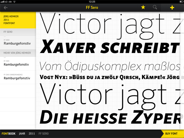
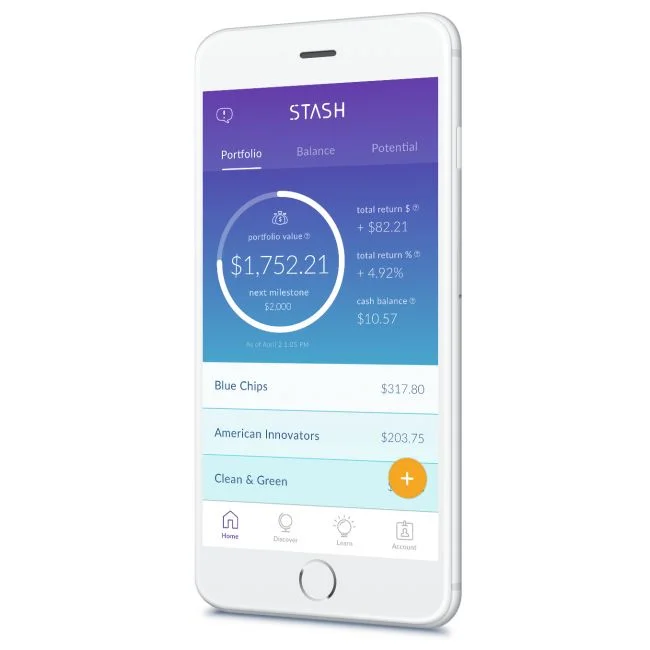
Text makes up 95 per cent of all digital communication. So no matter how carefully refined the user interface, icon design or choice of imagery within an app, your choice of font is absolutely crucial.
Typography has a direct impact on an app's user experience. If content is difficult to read, menu options are unclear, or the purpose of buttons and other calls to action are undecipherable, usability suffers enormously. And all these decisions must be made with a small screen in mind.
Read on for five top tips for picking the perfect font for your next app design...
01. Consider a native app font
Apple clearly saw the value in typography when it released its own sans-serif typeface, San Francisco, in 2015. Having used a mixture of Helvetica Neue, Lucida Grande, Myriad Pro and VAG Rounded for its various software, hardware and marketing needs until that point, SF ticks all the boxes for the tech giant.
As the default iOS font, San Francisco can be licensed to registered third-party developers to design apps for Apple's platforms. It's designed with utility and legibility in mind, and iOS automatically switches between Text and Display variants when the size drops below 10pt or above 20pt.
Three years earlier, Google had also released its own in-house designed app font for the Android platform: Roboto, which replaced previous system font Droid. Like San Francisco, it's a clean, modern sans-serif, but it has a few more personality quirks.
If a 'native' look is what you're going for, San Francisco or Roboto are a good bet – and the designers at Apple and Google have done the hard work in terms of ensuring they work on mobile.
02. Choose a font to suit the content
Both San Francisco and Roboto are clean sans-serif designs, which tends to be the default choice for most app designers: sans-serifs are neutral and safe, and great for legibility on buttons, menus and headlines.
If your app contains large amounts of long-form content, however, a serif may well be a better choice. Medium, iBooks, and newspaper apps such as Bloomberg or The New York Times all use serif fonts, for instance.
Apps such as these must cater to a wide variety of ages and preferences within their readership. If your app features large bodies of text, it may be worth building in some level of customization of both font and size to cater to particular user needs.
03. Use size and weight to create hierarchy
Apple advises a minimum of 11pt text to maintain legibility on the iPhone, iPad and Apple Watch, although try to avoid pushing the limits. The ideal value is more like 15-19pt, so allow plenty of space and avoid over-cluttering the interface.
San Francisco, Roboto and popular app design alternatives such as Open Sans, Proxima Nova and Museo Sans come in a range of useful weights, so make full use of them for emphasis and hierarchy. You don't have much space to work with, and bringing a key element up a weight or two can work wonders to draw attention.
As a rule of thumb, Regular weights are best for the minimum 11-19pt range, Medium weights work well from 20-34pt, and anything above that – usually main headlines – works well in Bold. Light and Ultralight weights are best saved for very large type, as legibility will suffer otherwise.
Consider line-length as well. On average, a website will have 60–75 characters per line, whereas apps are much narrower: you're looking at more like 35–50.
If lines are too long, they become unwieldy and users can lose track of the information; too short, and reading becomes unnatural. In practice, if you meet the font size guidelines you should avoid these problems.
04. Add a twist of personality
When it comes to very pared-back, minimalist, functional interfaces there aren't so many tools at your disposal to add character to your app design. Flat design is all about colour, simple shapes – and typography.
Accordingly, if type is one of the most prominent aspects of an otherwise brutally simple user interface, a display font that has some subtle, but unique quirks is worth considering. Commonly used, neutral typefaces are effective but you could run the risk of your app losing its identity.
Typefaces that have flourishes or particular design features on certain characters are worth a look. Browse Google Fonts for free options such as Raleway or Quicksand, or license a more complex and versatile typeface such as Klinic Slab.
05. Leave plenty of white space
One of the most important rules in app design is to avoid clutter at all costs, and this inevitably has a knock-on effect on your font choices, as well as how you apply them in the design process.
Mobile screens don't give you much space to work with, but you need to leave as much of it free as possible and respect the breathing space between elements. Too much text, and too many options to choose from, adds nothing but confusion and is not a satisfying user experience.
Likewise, leading between lines and paragraphs needs to be sufficient. Crushing this down to fit too much content into a single screen is an all-too-common mistake that will frustrate users who are used to apps that make their lives simpler and easier.
When the 'white space' rule is combined with the minimum size guidelines for text, the outcome is clear: you need to cut it back, not squeeze it in.


